Problem
The current iteration of wkdu.org was built in the mid 2000’s and now runs on unsupported versions of Drupal and PHP. On top of this, the user experience is a royal pain for both public and internal usage. It is also riddled with hacks and bugs, and aesthetically looks a little bit too “college radio”.
Solution
While I was station manager, Peter Liu (WKDU web admin) had expressed to me an interest in tackling the project, but only felt equipped to handle the data and coding side of the project. With my ability to lead the research and design aspects, in winter of 2020, Peter, Natalie (Personnel director), and I finally dug into rebuilding this monolithic site.
Initial Research
Most of my time on this project in early-mid 2020 was spent conducting contextual inquiry, interviews & surveys about functionality and design of the existing WKDU website. By the end of the year, we compiled a spreadsheet of 113 features and fixes requested by participants. Each item contains notes, possible solutions, relevant components, relevant scope, relevant audience, and issue severity (ranging from “Scope creep” to “Blocks user goal completely”).
Concept Design
To gain a bit of momentum on the project I started with aesthetics, so I did a bit of additional research to gauge the most important design pillars, based on a scale of my own design. Essentially, users compare several concepts like “Organic” vs. “Synthetic” and “Experimental” vs. “Conventional” on a Likert scale. Then, they provided as much free-response as desired. In my insights presentation to the exec staff, I made sure to cherry pick lots of quotes from members, so everyone could feel part of the process.
I made three different aesthetic concepts for the project. One geometric, one organic/hand-drawn, and a modern Neuomorphic. Based on the research data, I suggested that the hand-drawn design concept would be preferable to the overall group, and most execs seemed fairly excited about it. On the development side we've been exploring Rough.js as an option for hand-drawn-like lines, but are wary of stability issues for whomever takes over this site's development from us in 10 years or so.
Content Prioritization Research
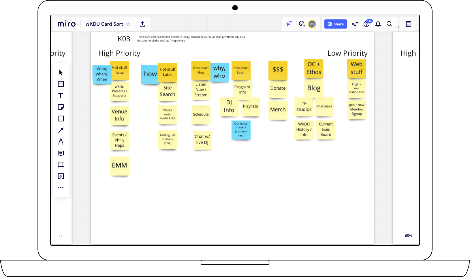
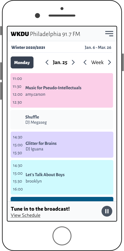
During WKDU's 50th anniversary marathon I conducted an in-person card sorting survey to get a range of opinions on top-level navigation and content structure. From this I uncovered a few key content groupings: Philly/Live Events, Broadcast Content, and Ethos/Family. Participants seemed to disagree about the importance of each category so each will need to be given equal importance in nagivation. I had predicted the Live Events category but when multiple participants included our blog, in-studios, and interviews in that column, it turned into a more holistic "WKDU's relationship with the Philly music scene" category. An interesting parallel category arised, called "WKDU Original Content", which cut into both Events & Broadcast Content categories. I am scheduling card sorts and interviews with public users in the coming weeks to see how their expectations diverge from internal opinions.
Alpha Designs
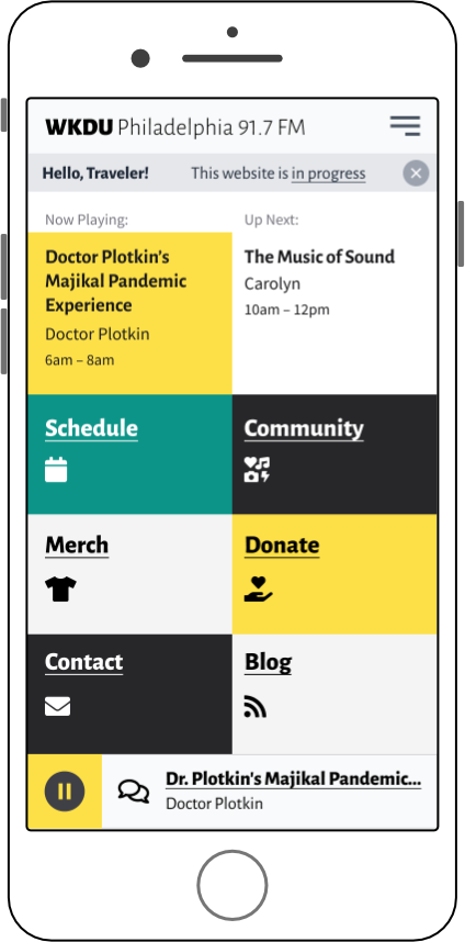
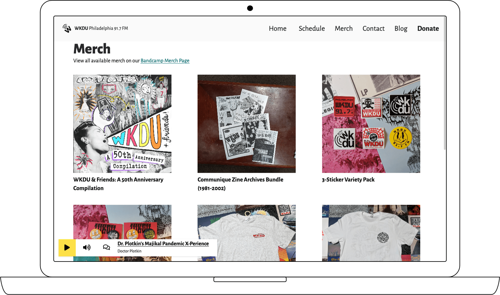
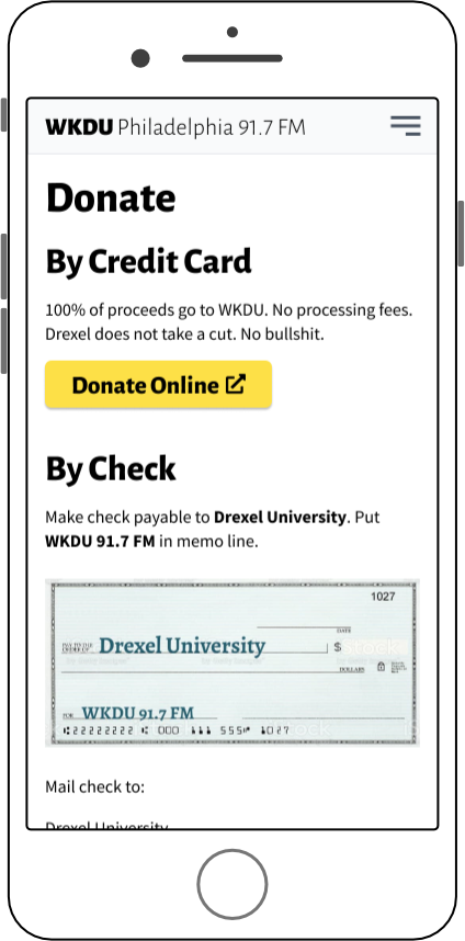
While the research is going on, I have also been designing and developing the MVP features for an alpha version of the new site in React/Next.js. With the basic functionality in place for the public, this will allow us the flexibility to experiment with designs and progressive enhacements.