Problem
I went out to buy mint chocolate chip ice cream one day, and I was surprised that the grocery store had cartons advertising the color as white. I thought, "am I crazy? it should definitely be green." Wondering if this was a local oddity or a global trend, I put together a survey asking Reddit users for their postal code and what color they expected mint chocolate chip ice cream to be.
From here on I'll refer to mint chocolate chip ice cream as MCC-IC.
Explore the Data

Results
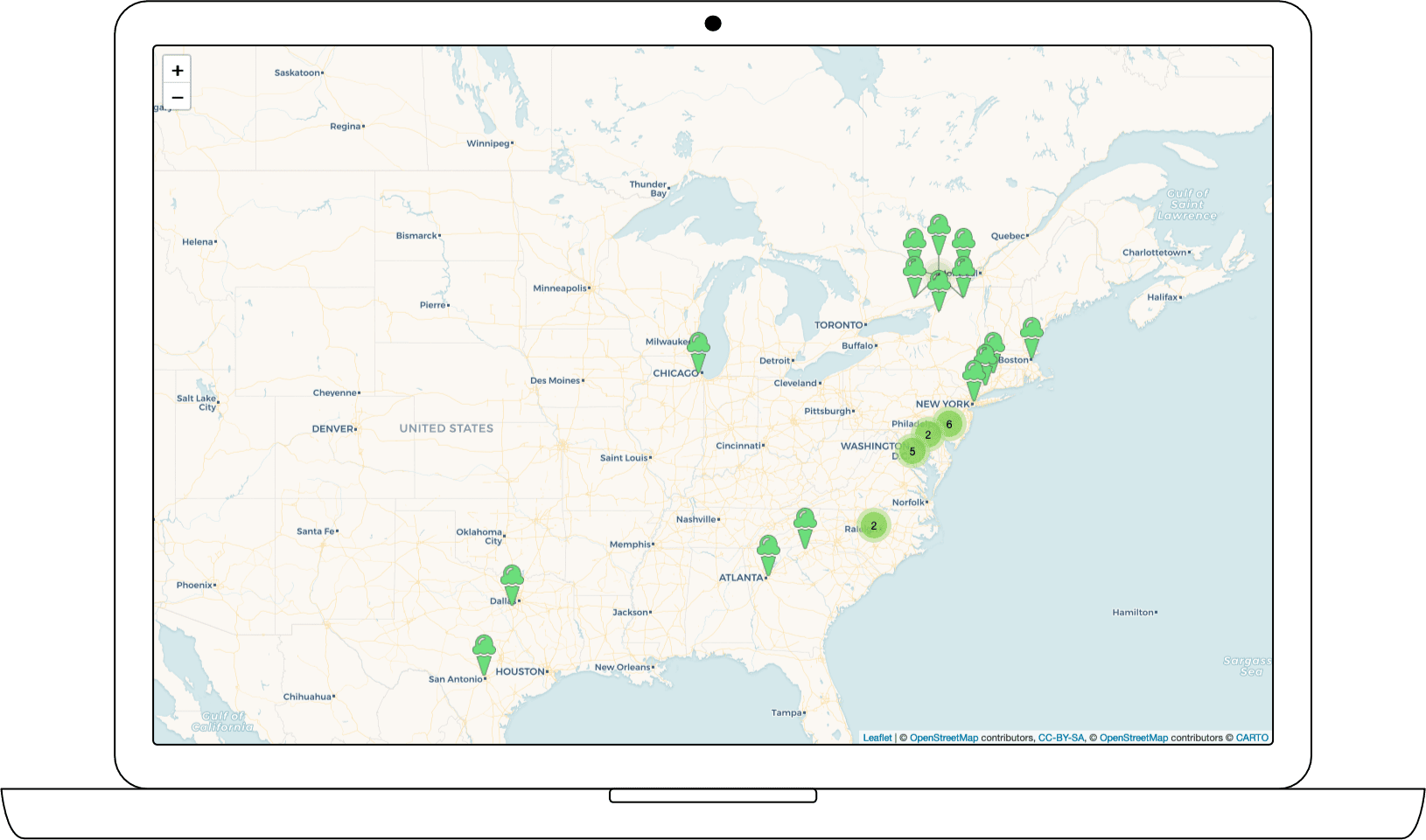
I received 46 responses with one duplicate and surprisingly no spam, so n=45. I didn't feel this was enough to claim scientific significance representing the global population's views on the matter, so I didn't bother with demographic breakdown, but suffice to say it's majority USA.
Apparently, white MCC-IC is only expected in the USA.
Respondents expected (raw count):
- green = 43
- white = 5
- teal = 3
Note these numbers add up to more than 100% because 5 respondents expected either "white or green", "white or teal". You can see these reflected in the map where I split icon colors in half.
Method Notes
I gathered location by asking for USA and UK postal codes. For other countries I placed respondents in their capitol cities. Next time I do an international geographic study like this, I will ask for nearest town/city. It only took me ~30 minutes to copy and paste GPS coordinates from Google Maps so if I ever do something at a broader scale I'll probably have to pay for a GPS conversion/lookup service.
I cleaned and analyzed data using Google Sheets, due to its ease of use. Then I summarized the data using R Studio. I created the interactive map with an R Studio package called Leaflet, a powerful and customizable library with so many cool features I feel like I barely scratched the surface.